Renter-Friendly Wall Decor Ideas (Without Putting Holes in Anything)
Blank rental walls are the reason so many apartments feel temporary. Magnolia paint, nothing on it, and a lease that says no holes — so people leave the walls empty for three years and wonder why the place never feels like theirs.
The no-holes rule is also less absolute than most renters assume. Some of it is genuinely off-limits, plenty of it is fine, and there’s a large middle ground where the answer is simply doing it properly.
Here’s what actually damages a wall, what doesn’t, and how to fill one either way.
What Actually Damages a Wall
Worth understanding, because it changes what you’ll risk.
A small nail hole is nothing. A picture pin leaves a hole roughly the width of a pencil lead, fills with a dab of spackle, and disappears. Most landlords expect a reasonable number.
Anchors are bigger but still fine. A wall anchor leaves a quarter-inch hole. Filled properly it’s invisible. Left open, it’s obvious and it’s what gets charged for.
Adhesive is the actual risk. Counterintuitive, but the thing that tears paint off a wall is almost always an adhesive strip removed wrongly or overloaded — not a nail. Damage-free products cause more damage than nails do, because people trust the weight ratings and pull them off at the wrong angle.
So “no holes” often means more risk, not less. Bear that in mind below.
Zero-Hole Wall Decor
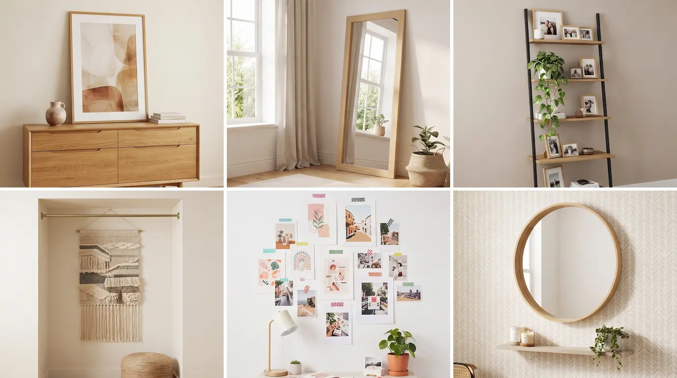
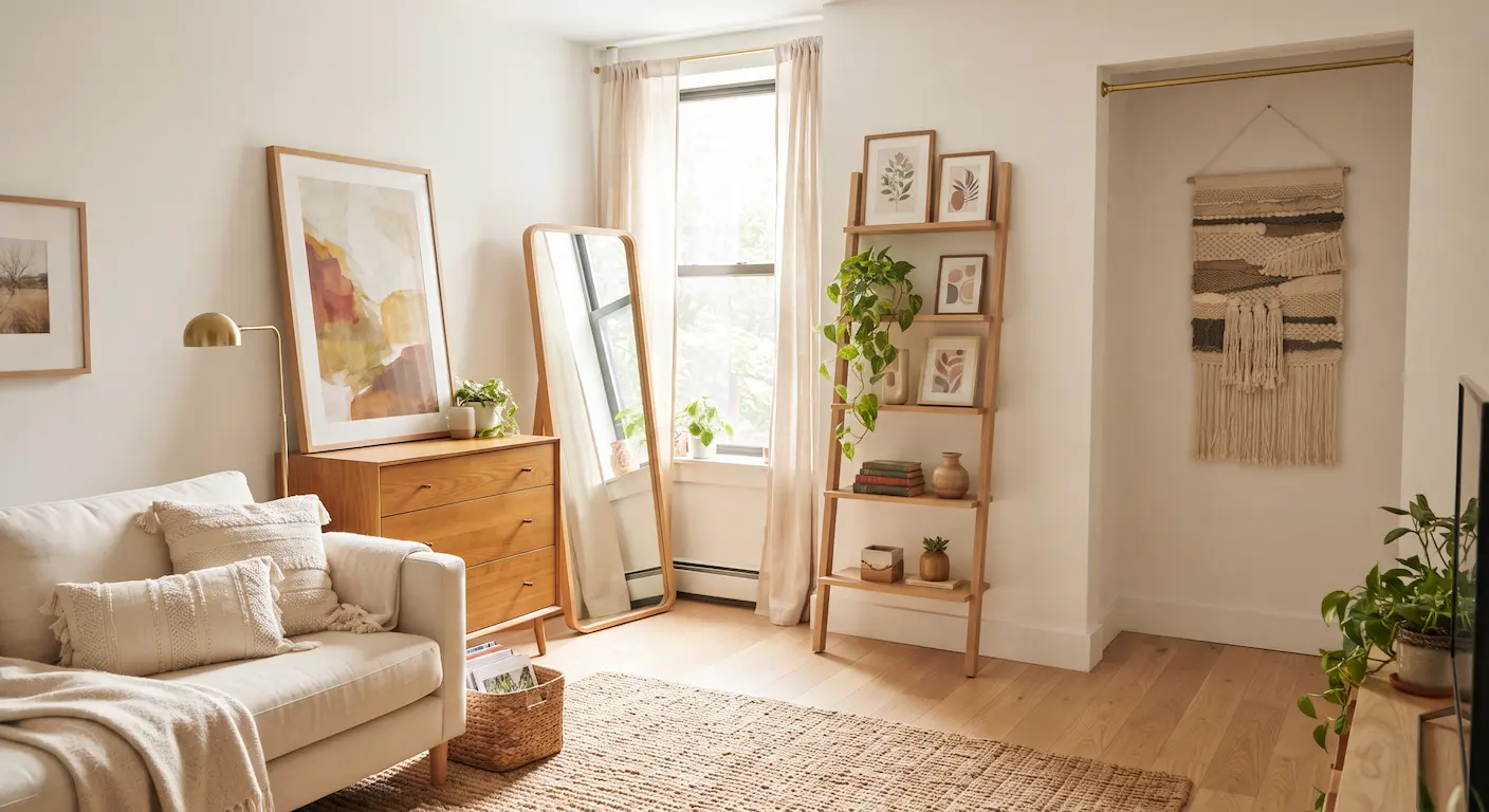
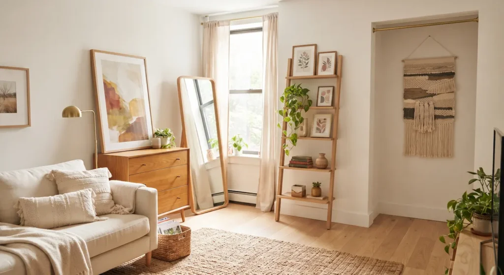
- Lean large art. Oversized pieces leaning on a dresser, shelf, mantel or the floor look deliberate and touch nothing. A large leaning piece is the single most effective no-hole option there is.
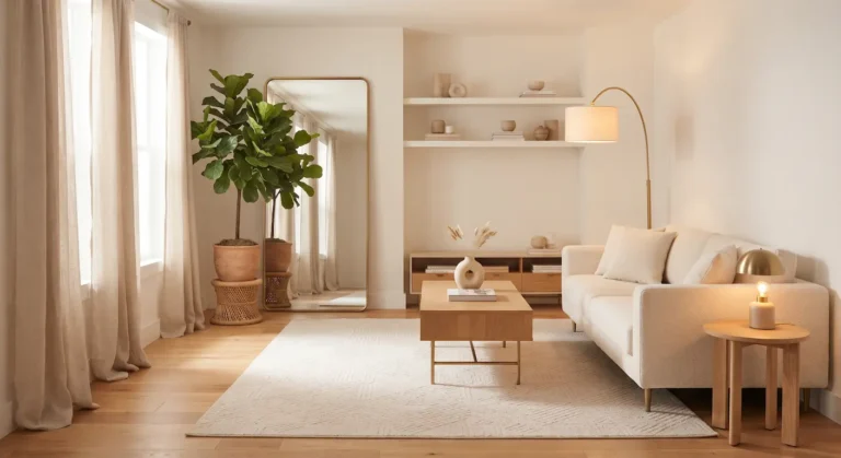
- A leaning mirror. Same principle, plus it adds light and depth. In a small apartment this is the highest-value wall decision you can make without a drill. Like a 65-inch leaning mirror.
- Freestanding shelving against the wall. A ladder shelf or tall bookcase covers wall area, holds art at eye level, and needs no fixings beyond an anti-tip strap. Like a leaning ladder shelf.
- Tapestries and fabric on tension rods. A rod inside a recess or between two walls holds a large textile with no fixings. It also softens sound, which helps a hard rental feel warmer.
- Washi tape borders and paper. Low-tack tape holds prints directly to the wall and comes off cleanly. It looks casual rather than styled, which suits some rooms and not others.
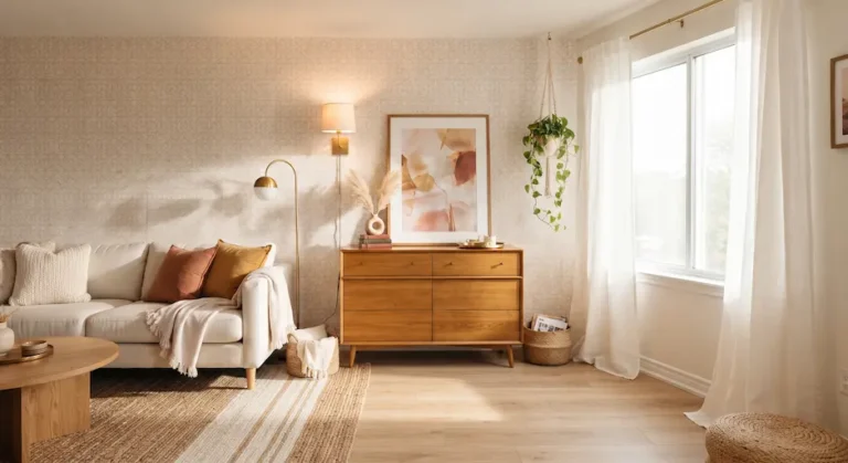
- Peel-and-stick wallpaper on one wall. Higher risk than the others — test a patch first, because on cheap paint it can lift — but nothing else changes a rental this much.
Minimal-Hole Options Worth the Risk
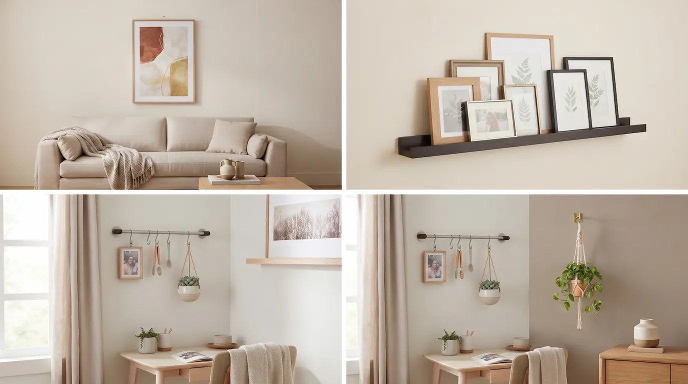
- One large piece instead of a gallery wall. A gallery wall of nine frames is nine sets of holes and never hangs straight. One large piece is two holes and looks better in a small room anyway. IMO this is the trade almost every renter should make.
- A picture ledge. Two or three fixings, and then you can rearrange as many frames as you like forever without touching the wall again. Best holes-to-flexibility ratio available. Like a 36-inch ledge, set of two.
- Plant hooks and hanging planters. One small hook each, and greenery does more for a blank wall than most art.
- A wall-mounted rail. Fixings once, then hang art, plants, hooks or lights from it and change your mind freely.
Scale and Placement: Where People Go Wrong
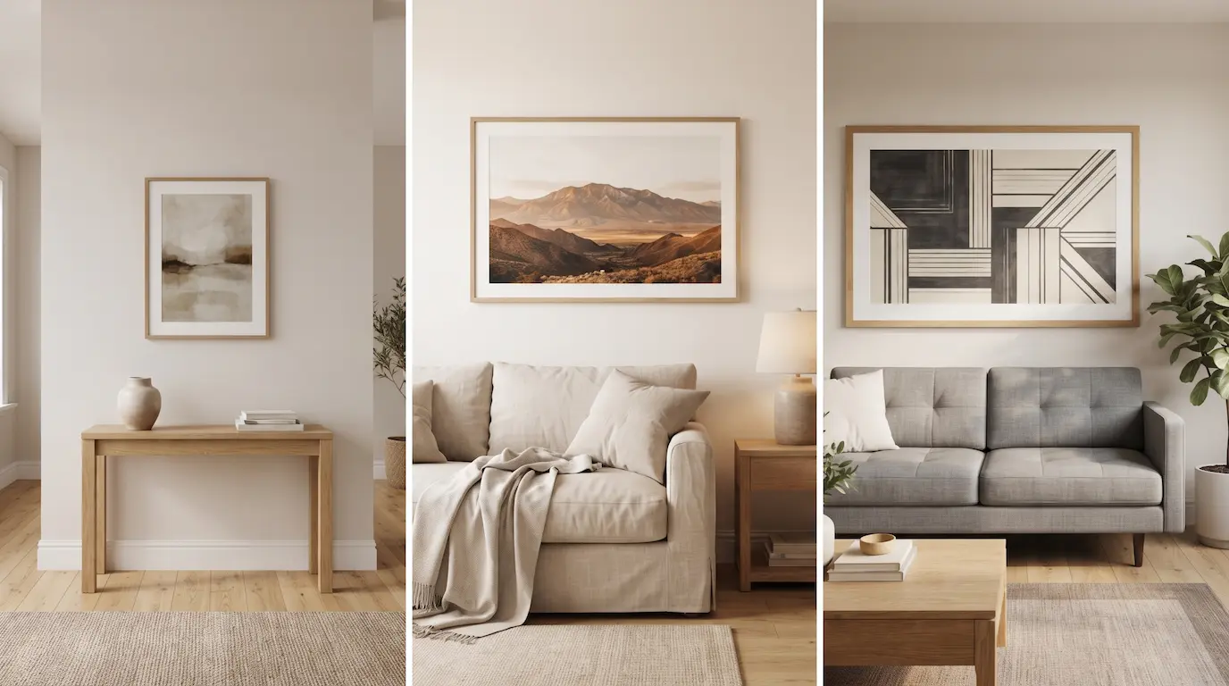
Renters tend to hang art too small and too high, and both are more damaging to how a room looks than the blank wall was.
Centre art at eye level — about 57 inches to the middle. That’s gallery standard and it’s lower than instinct suggests. Art hung too high makes a ceiling feel lower and the room feel unfinished.
Above furniture, leave 6-10 inches. Art floating a foot and a half above a sofa reads as disconnected. Close it up and the two become one composition.
Go two-thirds the width of the furniture below. A small frame over a large sofa is the most common mistake in rental decorating. FYI going bigger is nearly always the fix.
More on scale in budget decor that looks expensive.
How Many Holes Is Actually Reasonable?
The question every renter has and no lease answers clearly. Leases usually say “no damage,” not “no holes,” and those are different things.
Normal wear includes a reasonable number of picture hooks. In most places, a handful of small filled holes per room is expected and not chargeable. What gets charged is holes left open, oversized holes, and cracked or torn plaster around them.
The safest read: patch everything, photograph everything. Take dated photos of every wall on move-in and again after patching on move-out. That single habit resolves more disputes than any amount of caution during the tenancy.
Ask once, in writing. A short message asking whether picture hooks are acceptable costs nothing and usually gets a yes. It also gives you something to point at later, which a verbal yes does not.
If your lease genuinely forbids all fixings, stick to the zero-hole list above — it’s long enough to fill an apartment on its own.
Filling a Big Blank Wall
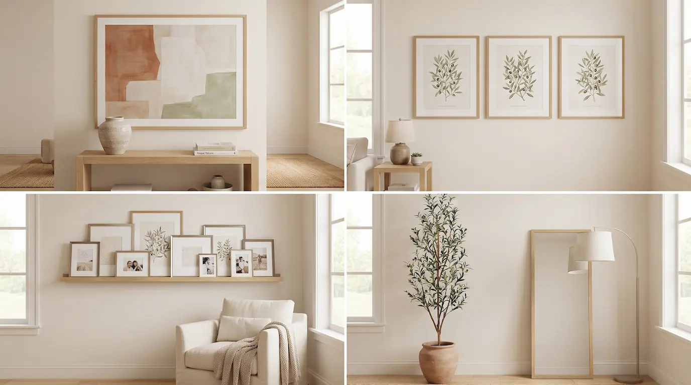
A large empty wall is the hardest thing to solve, because the instinct is to add several small things and that never works.
One oversized piece. Aim for something roughly two-thirds the width of the furniture below it, or half the wall if there’s no furniture. Large printed posters in simple frames cost very little and read far better than several small originals.
Or three pieces in a row, same size, same frames. The only gallery arrangement that reliably works, because the repetition does the composing for you. Space them evenly, 2-4 inches apart, centred at 57 inches.
Or a ledge running most of the width. Layer frames of different sizes along it, overlapping slightly. Two fixings, endless rearranging, and it fills horizontally in a way single pieces can’t.
Or don’t use art at all. A tall plant, a leaning mirror and a floor lamp against a blank wall fills it three-dimensionally Like a 6ft faux olive. and puts nothing on the surface. In rentals this is often the better answer.
Taking It Down Without Losing Your Deposit
Adhesive strips: pull the tab straight down, parallel to the wall, slowly. Some stretch 15 inches before releasing. If the tab breaks, warm it with a hairdryer and work floss behind it.
Nail and anchor holes: lightweight spackle, a putty knife, wipe flush while wet. That wipe is why professional patches disappear and amateur ones show as a ridge.
Peel-and-stick: warm each section and peel at a shallow angle close to the wall, never straight outward.
Full removal guidance is in 18 renter-friendly decor ideas.
Where to Get Large Art Without Spending Much
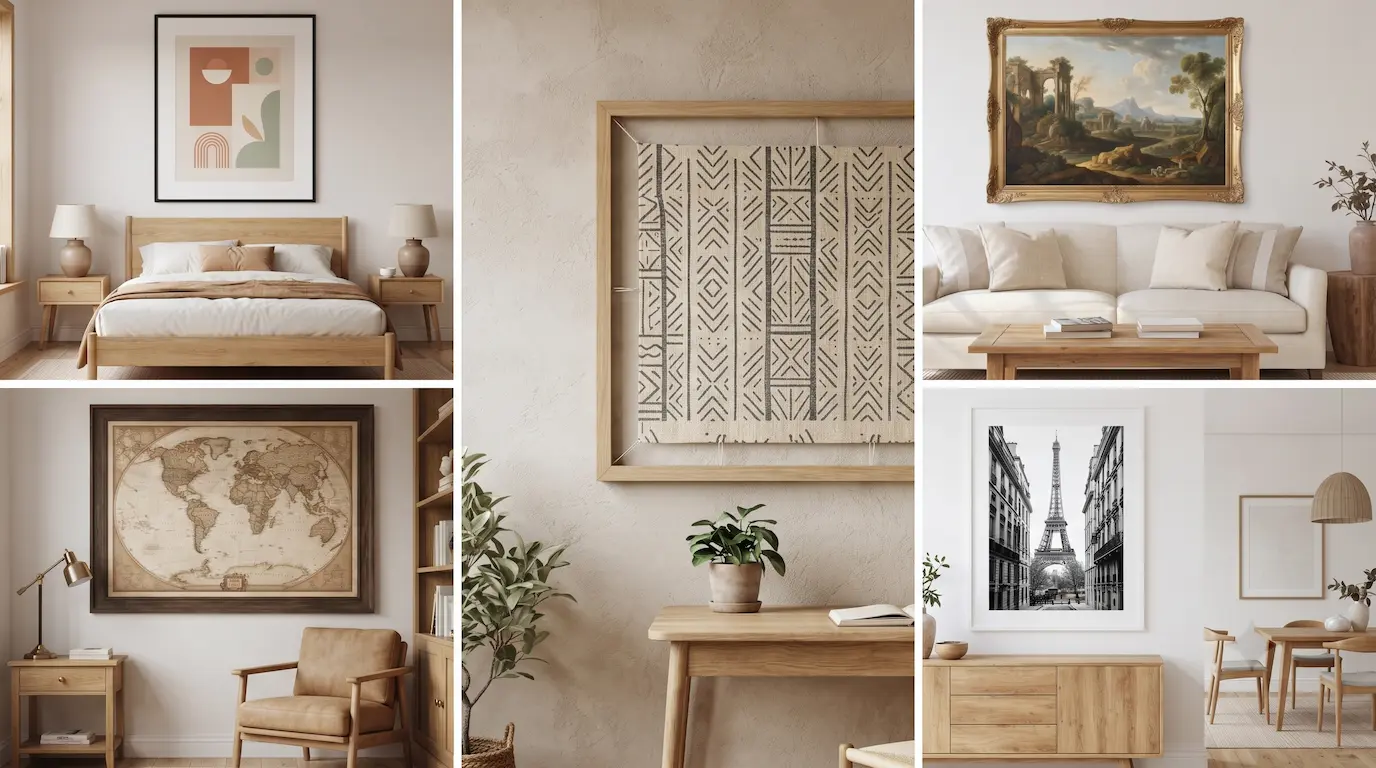
The advice to “go bigger” runs into an obvious problem: large art is expensive. It doesn’t have to be.
Printed posters in a decent frame. A large print costs very little, and the frame does most of the perceived-quality work. A cheap print in a good frame reads better than an expensive print in a bad one, every time.
Museum and archive downloads. Many major museums release high-resolution images of public-domain works for free. Download, send to a print shop, frame. Total cost is printing plus the frame.
Fabric or a textile panel. A large piece of interesting fabric stretched over a cheap frame, or simply hung from a rod, fills a wall for the price of a metre of cloth and adds texture at the same time.
One oversized frame around something ordinary. A map, a poster, a page from a book, a piece of wrapping paper. Scale and framing do the work — the content matters far less than people assume.
Your own photos, printed large. Almost nobody does this and it’s the cheapest genuinely personal option there is. One large black-and-white print of somewhere you’ve actually been beats generic wall art in every respect.
More of this thinking in 18 budget decor ideas that make a room look expensive.
Four Rental Wall Mistakes
- Trusting adhesive weight ratings. Halve them. They assume perfect application on clean, well-painted drywall, which is not most rentals.
- Hanging everything too high. Costs nothing to fix and changes the whole room.
- Nine small frames. More holes, more work, worse result in a small room.
- Leaving the walls empty for the whole tenancy. Three years is a long time to live somewhere that feels like a hotel because you were worried about a pencil-width hole 🙂
Lean Big, Then Hang One Thing
Start with one large leaning piece and a leaning mirror. Zero holes, immediate change, and it tells you what the room actually needs before you commit to anything permanent.
Then, if you’re willing to spend two holes, put up a picture ledge. It’s the one fixing that keeps paying, because you can rearrange forever without touching the wall again.
Which wall in your place has been blank the longest? Tell me in the comments — there’s a no-hole option for it.